OpenCms supports designing websites for multiple devices, e.g., a desktop computer, a tablet or a mobile phone. In particular, OpenCms let's you change formatters and templates dependent on the device your website is shown on. It also allows to deliver content elements only for some devices and to preview a webpage directly as it appears on various devices. Thus, each webpage has various device dependent representations.
The OpenCms options for device dependent representation are not an alternative for responsive design. It's more the way, that combining both approaches yields the optimal results.
1 What are options for device dependent design?
Device dependent design means that for several different devices you provide webpages that fit to the device's capabilities. Display size is of special interest and thus usually we can roughly devide the devices in three classes:
- mobile phones
- tablets
- desktop computers.
To get a pleasant presentation for your website on all of these devices, you can:
- build several websites with different styles, one for each device
- adjust styles according to the device or use a framework for responsive design that does the job and stay with only one website.
Both of the approaches have there pros and cons. Building several websites will give you complete freedom for adjustments, but increases production and maintenance effort a lot. Adjusting only the design of the webpage will decrease maintenance effort but cause high traffic (every content is delivered to every device), make formatters complex and does not let the content editor choose which contents are shown on which device.
OpenCms adds some of the benefits of several independent device specific websites to the approach of one website with several designs:
- Formatters can be chosen device dependent
- Templates can be adjusted (not only in style) device dependent
- Content managers can control which contents are delivered to which device
- Traffic is reduced, since not all contents have to be delivered and the formatting is also already (partly) done on the server-side
The main feature for device dependent representation are template context providers. They do not only provide you with the just listed benefits, they also allow you to preview your webpages on various devices.
2 Template context providers
Template context providers are called before a webpage is rendered and set the context for which the page is rendered. OpenCms ships with a default context provider, that sets the context either dependent on the user agent string of the requesting browser or a chosen preview. The provider distinguishes three different device contexts:
- Desktop
- Tablet
- Mobile
The context set by the provider can be explored by the template or by formatters and thus the generated webpage can be adjusted according to the context.
If a context provider is specified, two additional options are available in the page editor:
- The context menu has an entry "Show in device" that allows to preview the page in various devices

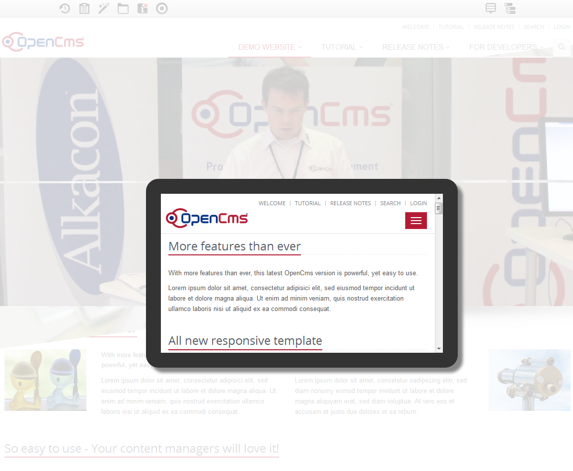
The device preview shows the current page as it appears in the chosen device in an overlay. In the background you see the original view on the desktop.
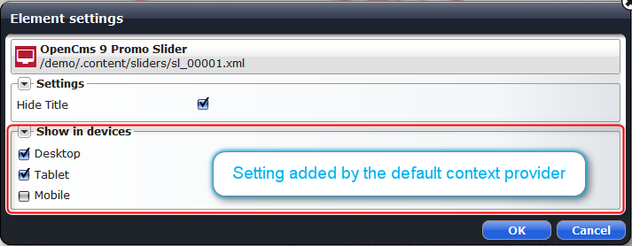
Note that the slider is missing in the preview - that's done by an element setting on the slider element, as shown in Figure [device_settings].
Fig. [device_preview]: Device preview for iPhone 5 landscape mode
- Each content element has a new setting "Show in devices" where it can be chosen for which devices an element is delivered.
2.1 Making a context provider available
The template provider is configured via the template property. For the default template context provider (with the default configuration), use
provider=org.opencms.loader.CmsDefaultTemplateContextProvider,template=/uri/of/your/template.jspto say that you use org.opencms.loader.CmsDefaultTemplateContextProvider as provider and that you hand the value /uri/of/your/template.jsp as parameter template to this provider.
In general the property is set in the format:
provider={fully qualified name of the provider class}[,{comma separated list of provider specific parameters}]When you set the template property via in the property dialog opened from sitemap or page editor, typically a select box appears where you can choose the available templates (listed with their Title properties as names). You can configure the value that is set if the template is chosen from this list. Set the template.provider property at your template to the appropriate value. For using the default provider (with the default configuration), set template.provider to:
provider=org.opencms.loader.CmsDefaultTemplateContextProvider,template=%(templatepath)The macro %(templatepath) is only available for the property template.provider and it extracts to the URI of the (template) file where the property is set. Using the macro instead of hardcoding the URI simplifies copying of templates.
2.2 Configuration of the default template context provider
The default context provider is configured via the file templatecontexts.json in the folder /system/shared/. In the file, you can configure the devices available for preview. The devices are grouped by contexts "desktop", "tablet" and "mobile". This groups are fix for the default context provider. Configuration for the groups can be adjusted, but typically the default configuration is sufficient. Here is an excerpt from the default configuration:
{
	"desktop": {
		"niceName": "Desktop",
		"path": "%(template)",
		"variants": {
			"small": {
				"niceName": "Small desktop (1024)" ,
				"width": 1024,
				"height": 768
			},
			"big": {
				"niceName": "Large desktop (1280)" ,
				"width": 1280,
				"height": 800
			}
		}
	},

	"tablet": {
		"niceName": "Tablet",
		"path": "%(template)",
		"variants": {

			...

		}
	},

	"mobile": {
		"niceName": {
			"en": "Mobile",
			"de": "Mobil"
		},
		"path": "%(template)",
		"variants": {

			...

		}
	}
}
For each context you can configure:
- a (optionally languguage-specific) nice name
- a path to the template that should be used for the context
- device variants for each context, each with (langugage specific) nice names and display resolutions specified by width and heigth.
In the config-file you can use macros to access provider parameters. In the given default configuration the template parameter is accessed via %(template). You could also call the provider with different parameters. For example, you could provide different templates for different contexts.
2.3 Using context information
Templates and formatters can react on the context a webpage is requested in. If a context provider is configured, access to the actual context is available in template and formatter JSPs (and of course in function providers). Use
${cms.template.name}to get the current context. For the default context provider, the value is either "desktop", "mobile" or "tablet". Dependent on the value you can
- Choose CSS styles
- Add/remove containers
- Show more/less content via a formatter
- ...
2.4 Writing own context providers
The default context provider distinguishes the contexts desktop, mobile and tablet. The context is chosen via server-side analysis of the HTTP request header information HTTP-Accept and User-Agent.
If you prefer another variant to detect devices or another set of available contexts, you can achieve this by writing your own template context provider. Your provider must implement the interface I_CmsTemplateContextProvider from the package org.opencms.loader. See the JavaDoc and the source code for more information.
3 The <cms:device> tag
The <cms:device> tag is an easy way to render a JSP device specific. It takes a comma separated list of contexts as attribute and renders it's body only if in a specified context. To use the tag, no context provider needs to be specified. The available contexts are the same as for the default template context provider.
Here's an example JSP that uses <cms:device>:
<%@ taglib prefix="cms" uri="http://www.opencms.org/taglib/cms"%>

<html>
    <head><title>Simple Device Demo</title></head>
    <body>

        <cms:device type="mobile">
            <p>You are browsing with a mobile device!</p>
        </cms:device>
        <cms:device type="desktop">
            <p>You are browsing with a desktop device!</p>
        </cms:device>
        <cms:device type="desktop, tablet">
            <p>You are browsing with a tablet or a desktop!</p>
        </cms:device>
        <p> Other content displayed on all devices… </p>
    </body>
</html><cms:device> is subsumed by the default context provider. Nevertheless, it can be more convenient to use the tag.4 Adjusting caching behavior
Whenever a JSP renders device specific, i.e., dependent on the provided context, for each context variant, an extra version of the rendered HTML has to be cached. That means, whenever rendering depends on ${cms.template.name} or <cms:device>: use the caching directive device to configure the flex cache for your JSP. For more information, see the topic about the flex cache.
