The form-based and also the inline content editor are based on widgets. For each input field in the editor a special widget is configured that defines how the value can be set. The available widgets reach from check and select boxes up to very advanced image selection or location picker widgets.
Here you get an overview on the available widgets and learn how you configure the widgets.
Note that, if the provided widgets do not satisfy your needs, you can also write own widgets.
1 How to configure a widget?
OpenCms chooses for each content element a suitable widget. The choice is made dependent on the element's type. But it is also possible to replace the default widget or configure this widget by adding a <layouts> node under xsd:annotation/xsd:appinfo in a content type's schema definition, and for each element where widget or widget behavior should change, a <layout> sub-node. Here is an example:
<layouts>
    <layout element="..." widget="..." configuration="..." />
</layouts>
2 Available widgets
Widgets are used to create a suitable content editor for XML content. The widgets to be used are defined in the XSD (schema definition) of the content type. Compared to the old XML content editor some configuration parameters have been added, changed or removed. The following sections will describe each widget and its parameters with a short example.
OpenCmsDateTime it won’t be handled as thus. The data type of an element defined in the XSD is responsible for the internal handling of the values. The usage of data types increases the data quality what affects not only content retrieval and performance but also the overall data integrity e.g. keeping internal links intact.In the following sections you will find code snippets showing how to use and configure the distributed widgets. If a specific data type makes sense for the usage of a special widget the code snippets will contain the <xsd:element>- node, otherwise the examples only show the widgets configuration made in the <layout>-node assuming that the corresponding element uses OpenCmsString as type attribute.
2.3 Display widget
The display widget only shows a value without the possibility of modification. The value this widget displays is configured as an attribute inside its layout node:
A possible configuration could look like:
<layout element="Display" widget="DisplayWidget"
        configuration="Value that is simply displayed and not editable." />
2.4 Selector widget
The selector widget provides a drop down with a set of options.
The layout for this widget could look like:
<layout element="Selector" widget="SelectorWidget"
        configuration="Option 1|Option 2*|Option 3|Option 4" />
Read the section on configuration of select widgets to get more information.
2.5 Textarea widget
The text area widget provides a HTML text area input field that can be scrolled if the text is too large to be displayed completely. The field can also be resized within the editor.
In the configuration parameter you can define the count of rows the text area displays when it’s opened initially. If no configuration is set, the default of fife rows is taken.
<layout element="Textarea" widget="TextareaWidget" configuration="3" />2.6 Radio-select widget
The radio button widget provides a group of radio buttons for single value selection.
The configuration could look like:
<layout element="RadioSelect" widget="RadioSelectWidget"
        configuration="Option 1|Option 2*|Option 3|Option 4" />
For more information on the configuration, look up the section on the configuration of select widgets.
2.7 Multi-select widget
The multi-select widget provides a group of check boxes to select one or more value.
The configuration could look like:
<layout element="MultiSelect" widget="MultiSelectWidget"
        configuration="Option 1|Option 2*|Option 3|Option 4*" />
For more information on the configuration, look up the section on the configuration of select widgets.
2.8 Combo widget
A combo widget offers a pre-defined set of select options with the ability for individual text input.
The configuration could look like:
<layout element="Combobox" widget="ComboWidget"
        configuration="Value 1|Value 2| Value 3" />
For more information on the configuration, look up the section on the configuration of select widgets.
2.10 Html widget
The Html widget makes use of TinyMCE which has been extended for a lot of special CMS features.
The widget it used as default for all elements of type OpenCmsHtml and its default configuration is specified in the opencms-vfs.xml. Special configuration is possible for each element. The configuration attribute in the layout must contain the activated options as a comma separated String value:
<layout element="Text" widget="HtmlWidget"
        configuration="height:400px,link,anchor,source,downloadgallery,formatselect"/>
More information about possible configuration options for the Html widget are found TODO:LINK_TECHNOTE here.
2.11 Localization widget
The localization widget provides a standard HTML form input field for overwriting localized values of a resource bundle. The resource bundle is configured with the widget configuration attribute. An optional key name to look up in the bundle can be given, too, in case it is different from the element name: key=mykey.
The locale to get the value for can be configured, by adding a configuration directive: locale=en.
<layout element="Localization" widget="LocalizationWidget"
        configuration="org.opencms.workplace.messages|key=mykey|locale=en" />
To use the stored localization values and have the values of the resource bundles as fallback, use the CmsXmlMessages object.
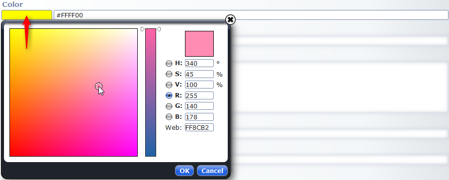
2.12 Color-picker widget
With the color picker widget you can comfortably choose a color.
This widget does not need any configuration, just use the element type OpenCmsColor.
<xsd:element name="Color" type="OpenCmsColor" />2.13 Date-picker widget
The date picker widget provides a convenient way of specifying dates.
This widget does not need any configuration, just use the type OpenCmsDateTime.
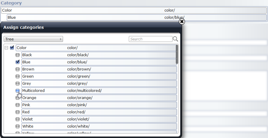
<xsd:element name="Calendar" type="OpenCmsDateTime" />2.14 Category widget
The category widget provides a category selection in a comfortable way.
The category widget is automatically assigned to elements of the type OpenCmsCategory what will enable to store the multiple selections.
OpenCmsVfsFile with the category widget, but then you won’t be able to make a multi selection.<xsd:element name="Category" type="OpenCmsCategory" />Optionally the widget's default behaviour can be changed by an additional configuration like:
<layout element="Category" widget="CategoryWidget"
        configuration="category=/.categories/color/|onlyleafs=false|parentSelection"/>
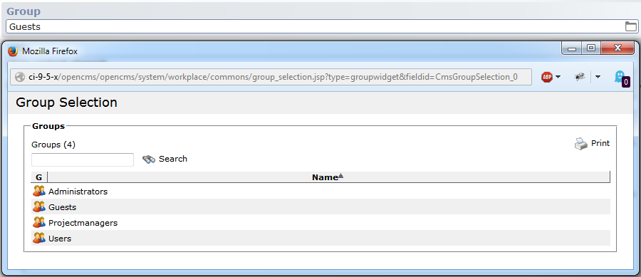
2.15 Group widget
The group widget is a special select box that offers o list of groups within OpenCms.
The widget must be chosen via a layout node. It has no extra configuration attribute.
<layout element="Group" widget="GroupWidget" />2.16 Multi-group selector widget
With the multi group widget you can select multiple groups at once.
The widget can be choosen by the following layout node.
<layout element="GroupMulti" widget="GroupMultiSelectorWidget" />Available configuration options
-
groupfilter A regular expression to filter available groups
-
groups A comma separated list of group names to show in the select box.
Please note, if this configuration option is used, groupfilter and includesubous are not considered anymore.
-
includesubous A Boolean flag to indicate whether sub OUs should be scanned for groups to select.
-
oufqn The fully qualified name of the OU to read the groups from.
To map the selected group to a permission to set, use the following mapping configuration:
<mapping element="MultiGroup"
         mapto="permission:GROUP:+r+v|GROUP.ALL_OTHERS:|GROUP.Projectmanagers:+r+v+w+c" />
This means that the +r+v permission is written for the principal GROUP on the resource. Additionally two permissions are written as default: for ALL_OTHERS, no allowed permission is set, for Projectmanagers, +r+v+w+c is set.
2.17 VFS file widget
The VFS file widget provides a selection of a file in the VFS. It either can be typed in directly or be chosen via a dialog. This dialog will come up by pushing the button on the right side of the input field. A detail description of the popup can be found in TODO:LINK "GallerySelection".

Pushing the folder button on the right of the input field, the dialog shown in Figure [Resource selection dialog] appears.
Fig. [VFS file widget example]: Layout of the VFS file widget
The widget is automatically chosen when the widget-element's type is set to OpenCmsVfsFile:
<xsd:element name="VfsFile" type="OpenCmsVfsFile" />Optionally the widget can be configured as follows.
<layout element="VfsFile" widget="VfsFileWidget"
        configuration="startsite=/sites/default/demo|hidesiteselector" />
Available configuration options
-
hidesiteselector The site selector is hidden (default).
-
showsiteselector The site selector is shown.
-
excludefiles Files are hidden in the popup tree.
-
includefiles Files are shown in the popup tree (default).
-
projectaware Show only resources of the current project.
-
notprojectaware Do not filter resources by project (default).
-
startsite The site or folder the popup tree is opened with.
2.18 VFS image widget
The VFS image widget displays images and offers a couple of image-related functions such as resizing, cropping, etc.
The widget is automatically chosen for elements of type OpenCmsVfsImage.
<xsd:element name="VfsImage" type="OpenCmsVfsImage" />Optionally, the widget can be configured. The configuration is using the JSON format.
A configuration string may look like:
{ scaleparams: 'q:70,r:2,c:CCCC00',
  type: 'gallery',
  startup: '/.galleries/samples/',
  usedescription: true,
  useformat: true,
  formatnames: 'imageleft:Image left|imageright:Image right|imagetop:Image top',
  formatvalues: ['150x?', '250x300', '?x250']
}
And then, the whole configuration looks for example as follows.
<layout element="VfsImage" widget="VfsImageWidget"
        configuration="{ scaleparams: 'q:70,r:2,c:CCCC00',
  		type: 'gallery',
  		startup: '/.galleries/samples/',
  		usedescription: true,
  		useformat: true,
  		formatnames: 'imageleft:Image left|imageright:Image right|imagetop:Image top',
  		formatvalues: ['150x?', '250x300', '?x250']
	}"
/>
Available configuration options
-
class Optionally provide a class that implements a dynamic startup configuration and special format values. The value must be a fully qualified class name.
-
formatnames A list of format names to select, with pairs of selectable value and selectable text, e.g.,
value1:optiontext1|value2:optiontext2.-
formatvalues The format values corresponding to the
formatnameslist, can be dynamically generated by the dynamic configuration class or given here. The list of values should contain width and height information, with a?as sign for dynamic size and with anxas separator for width and height. Example:['200x?', '800x600'].-
scaleparams The scale parameters used as default. No width, height or crop information should be provided!
-
startup The startup folder for the selection dialog. It can be dynamically generated by the provided class, or explicitely given here. To allow the use of a dynamic startup folder, give
dynamicas value here.-
type The startup folder type, can be
galleryorcategory. The folder can be dynamically generated by the provided class, in that case, usedynamicas value.-
usedescription Indicates whether the description input field for the image should be shown or not. (values:
trueorfalse)-
useformat Indicates whether the format select box for the image should be shown or not (values:
trueorfalse)
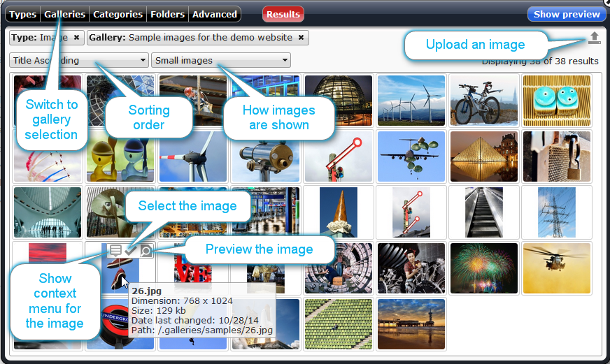
For more information relevant for the widget, in particular information on the selection dialog, see the description of the image gallery widget.
2.19 Image gallery widget
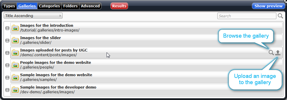
The image gallery widget provides a way to browse image galleries, select an image, change its title and description, scale it, or lookup image metadata. Furthermore, new images can be uploaded.
Via the icon ![]() you can upload a new image. The picture is added to either
you can upload a new image. The picture is added to either
- the gallery, the replaced image belongs to, or, if no picture is already present,
- the gallery (folder) chosen via the property
repositoryfolder_imagegallery. This property is read from the currently edited resource. It can be inherited and thus it is preferable to set it on a folder.
If neither repositoryfolder_imagegallery is set, nor an image gets replaced, the upload button is deactivated.
Via the icon ![]() , different functions can be accessed:
, different functions can be accessed:
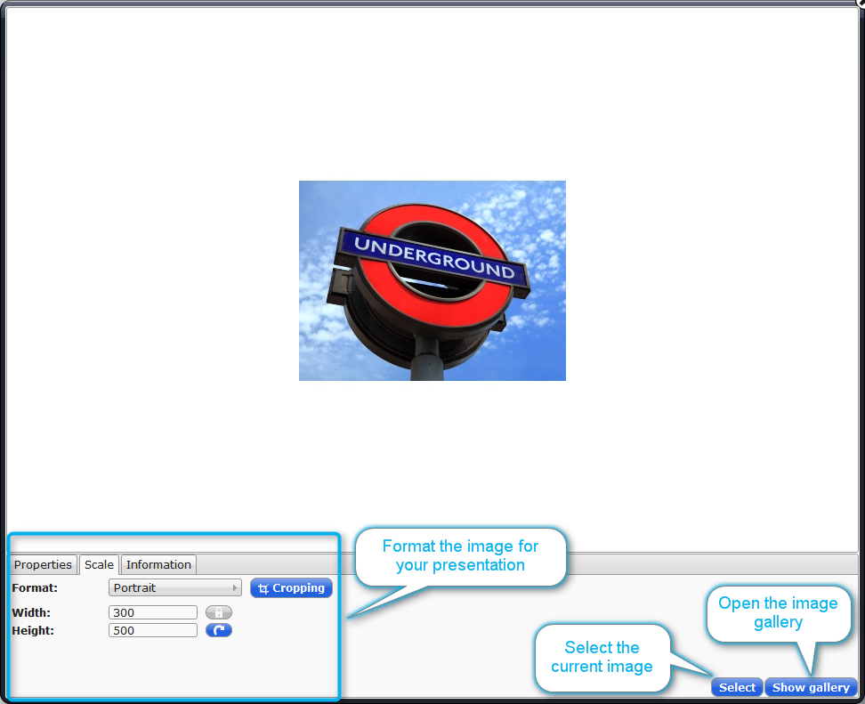
- Adjust how the selected picture is shown (see Figure [Adjusting a selected image]). This is the default if an image was selected before.
- Browse an image gallery (see Figure [Browse an image gallery]). This is the default if a default gallery is configured in the widget’s configuration and no image is already selected.
- Select which image gallery to use (see Figure [Select an image gallery]). This is the default if no image is already selected and no default gallery is configured in the widget’s configuration.
To use the image gallery widget, the editor element should have type OpenCmsVfsFile.
<xsd:element name="ImageGallery" type="OpenCmsVfsFile" />The configuration options for the image gallery widget are read from the configuration string of the widget. For nested XML schemas, the configuration string must be defined inside the nested content. The configuration string has to be formatted as JSON object, with the following possible options:
Available configuration options
-
class Provide a class to configure the widget dynamically. The class must implement the interface
I_CmsImageWidgetDynamicConfiguration.-
startup The startup (gallery) folder, for the widget. Set the value to
dynamicif it should be configured by class given via parameterclass.-
useformat If set to
true, content managers are allowed to scale and crop the chosen image for the presentation in their content. In how far images can be scaled is configured via the parametersformatnamesandformatvalues.Default:
false.-
formatnames Sequence of value-text pairs with different format options a content manager can select if
useformatis set totrue. If set, the parameterformatvalueshas to be set to a list with the same length as the sequence.The default values (with language dependent texts) are:
- original: insert the complete picture in its original format
- user: the user is free to crop the image and adjust the size
- free: the user is free to crop, but not scale the image
- small: the image, or the cropped part is scaled to 200px width
- big: the image, or the cropped part is scaled to 500px width
Example:
value1:Text 1|value2:Text 2.-
formatvalues A list of “width x height”-values, e.g.
['200x?', '800x600'], where?is used for a dynamic size. The format values correnspond to the format names given via the parameterformatnames. Thus, the list length should match the length of the sequence given toformatnames.
Instead of giving the format values explicitely, they can be created dynamically by the class given via parameterclass.
A possible layout configuration looks as follows.
<layout element="ImageGallery" widget="ImageGalleryWidget"
        configuration="{ formatnames: 'portrait:Portrait|landscape:Landscape',
                         formatvalues: ['300x500','500x300'],
                         useformat: true,
                         startup: '/.galleries/samples/'}" />
2.20 Download gallery widget
The download gallery widget provides a way to select VFS resources from galleries, or upload new resources into galleries.
The icons ![]() and
and ![]() provide similar functionality as in the image gallery widget, but additionally to image galleries also download galleries can be browsed. To configure to which gallery files are uploaded, set the property
provide similar functionality as in the image gallery widget, but additionally to image galleries also download galleries can be browsed. To configure to which gallery files are uploaded, set the property repositoryfolder_downloadgallery. For more detailed information, see the description of the image gallery widget.
To use the download gallery widget, the editor element should have type OpenCmsVfsFile.
<xsd:element name="DownloadGallery" type="OpenCmsVfsFile" />The configuration options are read from the configuration string of the widget. For nested XML schemas the configuration string must be defined inside the nested content. The configuration string has to be formatted as JSON object, with the following possible options:
Available configuration options
-
class Provide a class to configure the widget dynamically. The class must implement the interface
I_CmsImageWidgetDynamicConfiguration.-
startup The startup (gallery) folder, for the widget. Set the value to
dynamicif it should be configured by class given via parameterclass.-
gallerytypes Set which types of galleries are considered by the widget. Suitable types are
downloadgalleryandimagegallery. The value has to be a comma separated list.Default:
imagegallery,downloadgallery
Example configuration:
<layout element="DownloadGallery" widget="DownloadGalleryWidget"
        configuration="{ gallerytypes: 'downloadgallery',
                         startup: '/.galleries/downloads/' }"
/>
2.21 Link gallery widget
The link gallery widget provides a selection of a file in the link gallery. This gallery will come up by pushing the button on the right side of the input field.
When using the link gallery widget, the best choice for the editor element's type is OpenCmsVarLink.
To use the link gallery widget, additionally a layout node has to be added, where the configuration attribute is optional.
<layout element="LinkGallery" widget="LinkGalleryWidget"
        configuration="{ type: 'gallery',
                         startup: '/.galleries/links/' }"
/>
Configuration options for the link gallery widget
-
class An optional class implementing dynamic startup configurations and format values.
-
startup The startup folder, set to
dynamicif you want to use the custom class.-
type Can be
galleryorcategory, set todynamicif you want to use the custom class.
2.22 Location picker widget
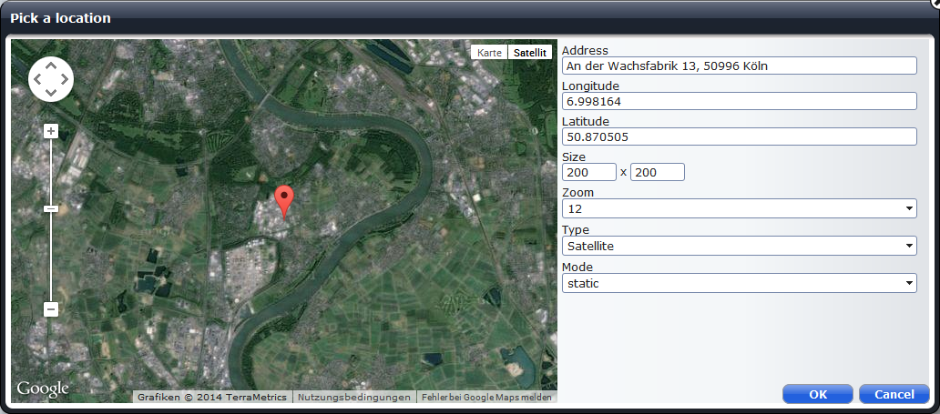
The location picker widget allows to select a location via a map and to store information about the selected location and how it should be displayed in a map. The widget works for Google Maps, displays a Google Maps map in the widget and stores the data relevant to display a map using the Google Maps API. Be sure to meet the licence conditions when using Google Maps.
If a location is chosen, the widget looks as in Figure [location_picker_widget].
Figure [location_picker_choose_location] shows the dialog that opens when you alter the location via the widget. The dialog's appearance depends on the widget's configuration. The dialog below is displayed for the default configuration that allows to change all values stored by the widget. To change the values, you can edit them manually. But for changing the address and the coordinates, you can also move the placemark in the map.
The location picker widget can be used for elements of type OpenCmsString. It is configured as shown in the example below.
<layout element="Map"
        widget="LocationPickerWidget"
        configuration='{"edit":["map", "address", "coords", "size", "zoom", "type", "mode"]}' />
The configuration string specifies which values should be editable via the widget. The configuration string used in the example resembles the default configuration that allows to edit all possible values. If a value should not be changed: just remove it from the list in the configuration string.
For the widget, the default value is important. If no default value is set, the widget uses
{ "address": "London", "lat": 51.5001524, "lng": -0.1262362,
  "height": 300, "width": 400, "mode": "", "type":"roadmap", "zoom": 8}
If you set your own default, use exactly the format of the standard default value. Possible values for the different settings are:
-
address Any string value that you will use to describe the location
-
lat Latitude coordinate of the location as used by Google Maps. Provided as floating point number.
-
lng Longitude coordinate of the location as used by Google Maps. Provided as floating point number.
-
height Height of the map that can be used when rendering the map. Given as integer value specifying the number of pixels.
-
width Width of the map that can be used when rendering the map. Given as integer value specifying the number of pixels.
-
mode The mode how the map should be rendered. Possible values are
"static"or"dynamic". The value should be used to indicate if a static or a dynamic map is shown.-
type Type of the map that should be shown. Valid values are the types available for Google Maps, i.e., "roadmap", "satellite", "hybrid" or "terrain".
-
zoom Specifies the zoom level that should be used to display the map. Valid values are the integers from 0 to 20.
The default value reflects the structure of the strings that the location picker widget stores. To easily access the single values stored in the string the class CmsLocationPickerWidgetValue in the package org.opencms.widgets. To use the class in a JSP add the following lines to your JSP (possibly replacing content.value.Map by path to your content element storing map information):
<jsp:useBean id="map" class="org.opencms.widgets.CmsLocationPickerWidgetValue" />
<jsp:setProperty name="map" property="wrappedValue" value="${content.value.Map}" />
3 Select widget configuration
If options are passed from XML content schema definitions as widget configuration options, the following syntax is used for defining the option values:
value='{text}' default='{true|false}' option='{text}'
help='{text}|{more option definitions}
For example:
value='value1' default='true' option='option1' help='help1'|value='value2'
option='option2' help='help2'
The elements default, option and help are all optional, while value is mandatory. There should be only one default option that is set true. If more than one is detected, only the first default found is actually used. If no option is given, the value of option defaults to the value of the given value. If no help is given, the default is null.
3.1 Shortcut syntax options
If you don't specify the value key, the value is assumed to start at the first position of an option definition. In this case the value does not need to be surrounded by the ' characters.
Example:
value='some value' default='true'could also be written as
some value default='true'Only if you use the short value definition as described above, a default value can be marked with a * at the end of the value definition.
Example:
value='some value' default='true'can also be written as
some value*Only if you use the short value definition as described above, you can also append the option to the value using a :. In this case no ' must surround the option. Please keep in mind that in this case the value itself can no longer contain a : char, since it would then be interpreted as a delimiter.
Example:
value='some value' option='some option'can also be written as
some value:some optionAny combinations of the above described shortcuts are allowed in the configuration option String. Here are some more examples of valid configuration option Strings:
1*|2|3|4|5|6|7
1 default='true'|2|3|4|5|6|7
value='1' default='true'|value='2'|value='3'
value='1'|2*|value='3'
1*:option text|2|3|4
1* option='option text' help='some'|2|3|4INFOlevel).


